When you wake in the morning, what do you usually grab first? When you are riding a bus or a train, what do you do to kill time? When you want to be updated with the news and trends, where do you search for them? Lastly, when you shop for some items, where do you buy it? You could have multiple answers for these questions but at some point, you have used your mobile device for all of these activities. Because of this behavior of the customers, businesses must be able to be seen and felt through these devices. Luckily, lots of businesses and even startups would build a website that will be viewable to the public. However, these websites should not be available using a personal computer only. It should be browsed through a mobile phone.
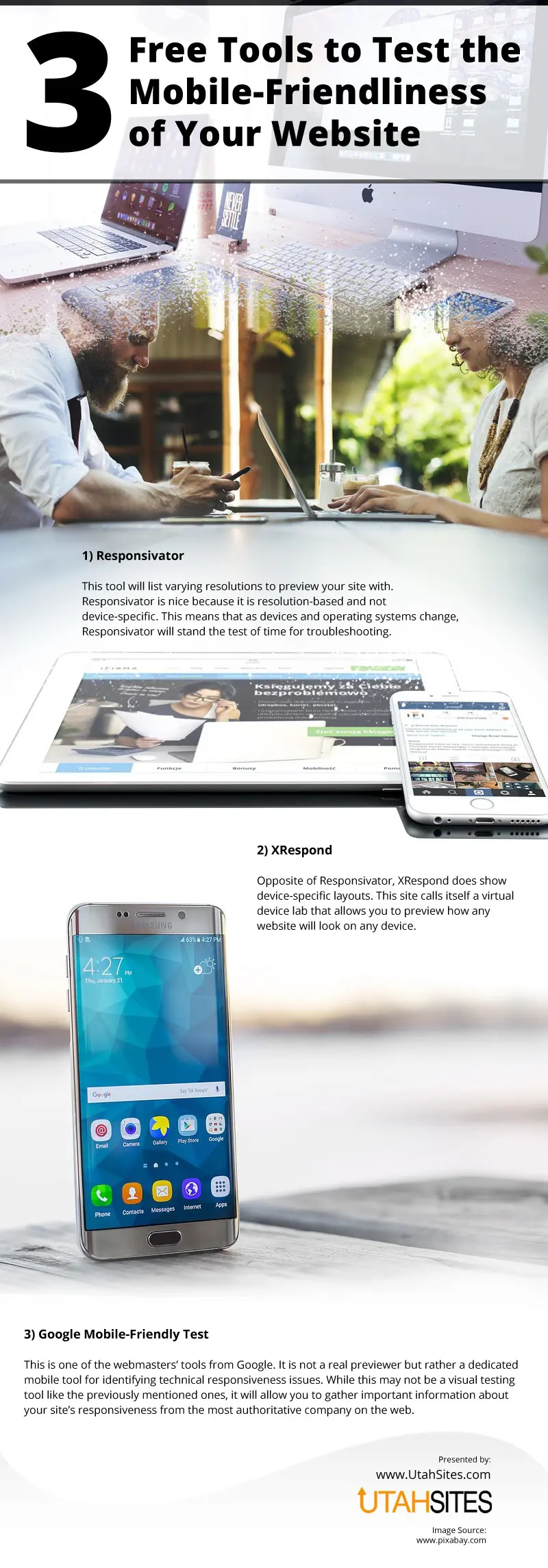
Designing mobile- friendly websites is not easy. There are lots of considerations that the designer must take. For one, the screens of these devices vary from small to large. Also, mobile devices have their own operating systems, will the website be seen the same across all devices. Therefore, before launching the website, it should undergo various testing whether it will be mobile friendly or not. Most website designs can be tested using the tools that can be found in this infographic.
1. Previewing the resolution of the website in a mobile device can be done using Responsivator. Even if you have thousands of phones with different models and manufacturers where you can preview the website’s resolution, it would still be effective and efficient to use this tool. Resolution is a very important aspect of the website. Poorly designed websites can be blurry and will be an eye sore to the user. This can cause higher bounce rates which will cause poor or no leads for the business. However, Responsivator checks the only resolution regardless of the device but as to lay out, XRespond can do the job for you.
2. Responsivator is resolution based while XRespond focuses on the template or lay out of the website when viewed using different kinds of device. Why do you need to check how mobile-friendly the website is using XRespond?. Remember that devices have specific operating systems. The OS will determine how your website will be presented when it is viewed in a specific device. You will notice that sometimes the same websites will have different layouts when viewed using different devices. So, to complement Responsivator, use XRespond.
3. Responsivator and XRespond are a virtual testing tool but if you want to gather more information about technical responsiveness of the website design, you must opt for Google Mobile-Friendly Test. It is a test that will show the assessment of authoritative companies about the responsiveness of your website. This may be helpful if you want to have an external opinion so that you can make necessary adjustments based on their recommendations.
4. Testing the mobile-friendliness of the website is a requirement before you officially launch the website so that the design will effectively represent the organization and the latter will be able to capture the right target market.
source: https://www.utahsites.com/3-free-mobile-friendly-testing-tools/
Comments
Download this infographic.


