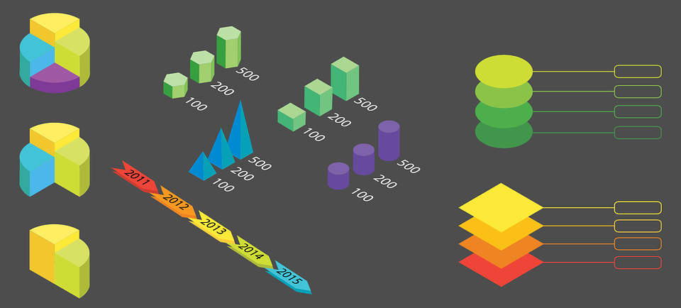
Infographics provide a way to visually represent data in a clear and appealing manner. You can build your own custom infographics from the ground up, use pre-made infographic templates, or infographic software.

(pixabay / almariel1)
There are a number of templates available for the choosing. Here’s a look at some of the most popular types of templates to help you select the best one for your needs.
- Informative – Need to convey text-based information in an easy to understand manner? The informational template is a smart choice. It displays a wealth of information in a clear and relatable way.
- Maps – Map-based infographic templates show location-based information. Maps can be shaded or highlighted in different ways to catch the eye and relate components spatially.
- Data-driven – This is the most frequently used of all the infographic templates and provides a way to showcase dry and complicated data in a visually interesting way. You can use graphs, charts, or the simple mention of significant numbers to tell a story. Statistical infographics allow people to get a visual on facts that would otherwise seem dry and difficult to understand.
- Stratification – These variations of data-driven infographics organize data into various levels, from the most to the least important. Pyramid charts are a common example of a stratifying or hierarchical infographic.
- Charts – If you have a lot of complex information to present, you can rely on charts and graphics to inform the reader.
- Contrast – This template presents a comparison of two types of information. It highlights the differences and the similarities between two different elements, including the advantages and disadvantages of each.
Why reinvent the wheel? Save time with infographic templates. Just make sure to choose the right template to communicate the message that you desire.


