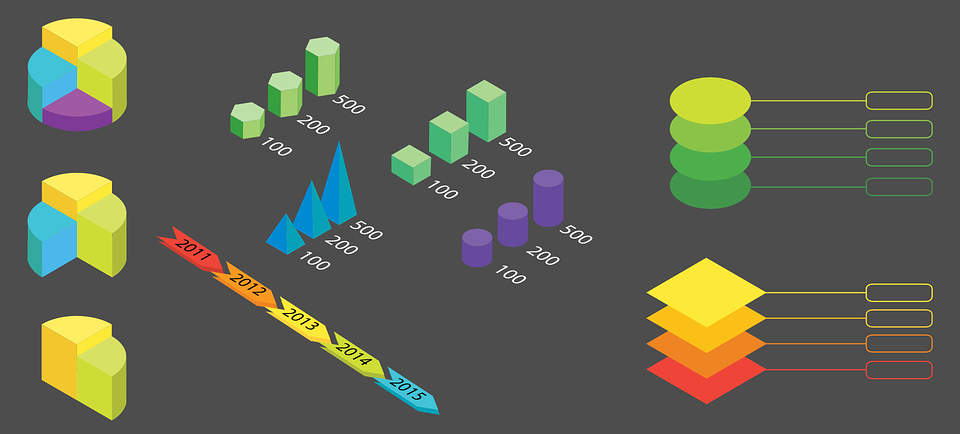
The primary goal of creating an infographic is to make something that is memorable and shareable to help increase traffic to your website. However, doing this takes some time and effort. It also requires knowing which type of infographic is best for showcasing your data.

(Pixabay / rawpixel)
Here are some different types of infographics you can use depending on the kind of information you are trying to present.
- Informational infographic — An informational infographic will be ideal to communicate a new concept, or to give an overview of a topic. Informational infographics rely on text more than other types of infographics. The information is typically divided into sections with descriptive headers. The design should lead the reader’s eye and direct them to which section is next. Since this type of infographic uses a lot of text, you need to make sure it’s easy to read. If you plan on using reverse type (white text on a colored background), make sure the font you use is legible and sufficiently bold to stand out.
- Timeline infographic — If you’re presenting something in chronological order throughout time, you’ll want to go with a timeline infographic. When using a timeline, make sure you have quite a few points to mark on the infographic. You can also use icons or other graphic elements to represent points in history. While your design doesn’t have to incorporate a straight line, it should lead the reader’s eye down a clear path through time.
- Statistical infographic — For information that’s data-heavy, it’s important to let your visual elements tell the story. You can accomplish this by using graphs, charts, icons, etc. This type of infographic is especially useful in the visualization of survey results.
- Process infographic — This type is ideal for providing an overview or summary of the steps involved in a process. An example of these kinds of infographics are the decision-making graphics that are popular on social media. They are generally both humorous and informative and follow a top-to-bottom or left-to-right flow.
- Geographic infographic — If you have location-based data, you should use a geographic infographic. Whether you’re using data from around the world, your country, or even specific areas of a city, you can show information in a graphic.
- Infographic resume — Creating an infographic of your basic information is an excellent way to supplement your traditional resume when you go for an interview. Not only will this show your creativity, but it will also present your resume more visually to give prospective employees a different context for your qualifications.
- Comparison infographic — Comparison infographics are like the Venn diagrams of infographics. They allow you to compare options or opposing ideas in a visual way, but they can also be a way to show similarities as well. For example, if you were to compare two similar services, you could include items that were completely different on each side of the infographic, while adding services that are similar down the middle. This kind of presentation can give readers a clear, unbiased look at differences and commonalities and help them make an educated decision.
- Hierarchical infographic — Hierarchical infographics present information from the most important to the least important, while also showing the relationship between each item. This type of infographic is generally presented in the shape of a pyramid, but can also be displayed as an organizational chart.
- List infographics — As the name implies, these types of infographics present items in a list format. To spice up the information, use visuals like icons and creative fonts.
While you may be tempted to use the same sort of template and style over and over again, you should aim for the best visual format for your information. Using the appropriate visuals, combined with a strong design, can help make your infographic a hit across the internet.


