Infographics are becoming the standard way to present short visual storytelling pieces across the internet. They are popular among marketers and consumers due to their ability to condense information while still presenting it in a compelling and appealing way.

(Pixabay / JuralMin)
However, infographics only serve their purpose if they are well-made. Luckily, there are plenty of examples of quality infographics on the internet to inspire you. But on the flip side, there are also many poorly designed infographics to serve as cautionary tales.
You can get your infographics right by understandings a few design principles and putting them into practice. Here are some things you can do to improve your infographics so you hit it out of the park every time:
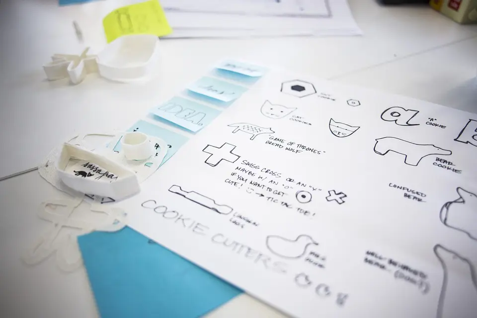
- Storyboard your infographic — Before you start to design your infographic, take a look at the information you are trying to present. What kind of story is the information telling? What angle do you want to take? How does that translate visually? Think of the information you need to include to tell your angle of the story. Then sketch a mockup design of how that story translates into your infographic. Include any headlines, graphs, and other data you consider relevant. Knowing how you want to design your infographic ahead of time will help you be more efficient when you work on the project with infographic design programs.
- Utilize existing layouts — If you don’t want to build an infographic from scratch, you can use a variety of existing layouts that can be found all over the internet on several different platforms. Just make sure the design you use suits the information you are presenting. If you are doing a compare and contrast infographic, use a two-column layout to show how both subjects compare in the same categories.
- Pick the best ways to visualize data — Depending on the type of data you use, there will be a good, better, and best way to represent that data visually. For percentages that contribute to a whole, it may be a pie chart. For comparisons, a bar graph may be the right choice. Just make sure that the chart you use accurately depicts the information to your readers.
- Find a fascinating headline — The headline for your infographic is one of the most critical aspects of the design. If it’s catchy, people will stop to look at your infographic. If it doesn’t pique anyone’s interest, then they won’t look at it or share it. Make sure you use descriptive words that help give readers an idea of what kind of information to expect.
- Don’t be afraid to use photos — Many people hesitate to use photographs when designing an infographic. However, even if you don’t have a professional photographer to work with, there are plenty of stock photos available for your infographics. Make sure to choose pictures that look natural. Images that appear staged may end up detracting from your infographic.
- Make it interesting with design elements — One of the easiest ways to make your infographic engaging is through fonts. The typography you choose can enhance your storytelling in many ways. Just make sure that the fonts you select complement each other, that they are legible, and that you choose only two or three fonts total. Combine your typography with other elements like icons and images to make the infographic eye-catching and visually appealing.
If you follow these tips and practices, it won’t be long before you’re creating visually compelling infographics that you can take pride in and that your readers will share with others.


