
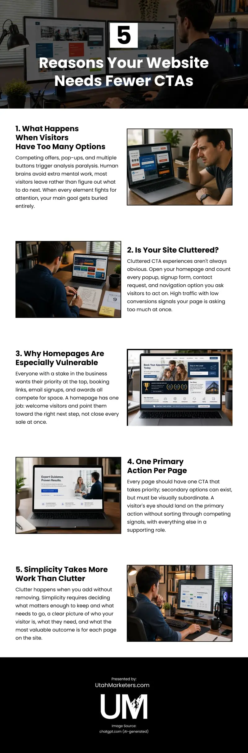
Too many calls to action don’t increase conversions; they prevent them. When competing offers, pop-ups, banners, and multiple buttons all demand attention at once, analysis paralysis sets in. Most visitors leave rather than sort through the confusion. Cluttered CTA experiences aren’t always obvious. Still, high traffic with low conversions is a reliable signal that a page is asking too much at once; counting every pop-up, signup form, and navigation option on a single page usually reveals the problem. Homepages are especially vulnerable because every stakeholder wants their priority featured at the top, producing a page that tries to do everything and succeeds at very little. The fix is a single primary CTA per page, with secondary options visually subordinate so the visitor’s eye lands on the most important action without sorting through competing signals. Achieving that simplicity requires more deliberate work than clutter does, deciding what matters enough to keep and what needs to go is the discipline that turns overwhelmed visitors into actual conversions.
source: https://www.utahmarketers.com/why-your-website-needs-fewer-calls-to-action/
Comments
Download this infographic.