
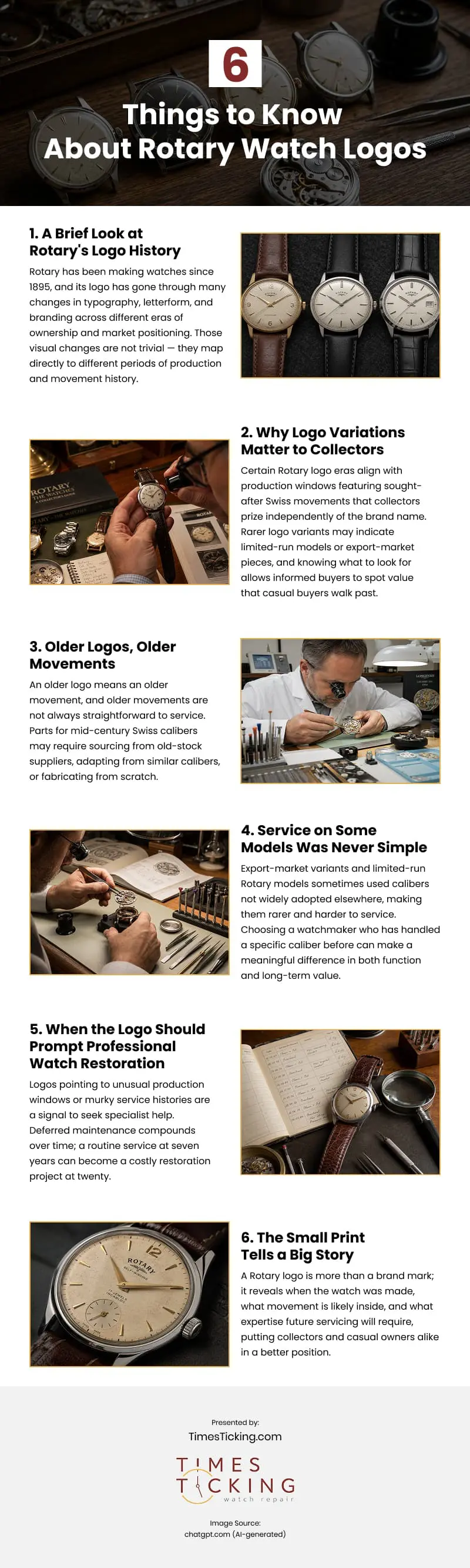
Rotary has been producing watches since 1895, and the logo changes across that long history are far more meaningful than they might first appear. Each visual era maps to a specific production window, and for collectors and owners alike, knowing how to read those markings opens up a more informed picture of what a watch is and what it needs. Certain logo eras align with mid-century Swiss movements that collectors prize independently of the Rotary name, and rarer logo variants on export-market or limited-run pieces can signal hidden value that casual buyers routinely overlook. An older logo also means an older movement, and older movements present real servicing challenges; parts for mid-century calibers may need to be sourced from old stock, adapted from similar movements, or fabricated from scratch by a watchmaker with genuine vintage expertise. Some Rotary models were never straightforward to service, with export variants and limited-run pieces using calibers not widely adopted elsewhere, making technician familiarity with the specific movement genuinely important. When a logo points to an unusual production window or a watch carries a murky service history, seeking out a specialist is the right move; deferred maintenance compounds over time, and what would have been a routine service at seven years can become a costly restoration at twenty. Ultimately, the logo on a Rotary dial is a compressed biography of the watch, telling you when it was made, what is likely inside, and the level of expertise required for future care.
source: https://www.timesticking.com/what-rotary-watch-logos-reveal-about-age-and-repairability/
Comments
Download this infographic.